The initial idea of this year's monitor was that the two industries of ports and tourism were really the driving force behind the economy's upturn in Savannah. There is a quote in the story about the two industries being "tentacles" that reach out and assist other industries with things such as jobs and other opportunities. So we thought that maybe we could illustrate these two tentacles reaching out for things. Several editors, the writer and myself were all gung-ho on this idea, so this is what I came up with:

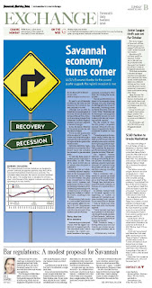
The response overall was pretty "eh." It looked cartoony, I thought, and new readers of the story didn't get the whole "tentacles" feel from the story at all. So, it was back to the drawing board. The headline for the story was "Savannah economy turns corner," and the real overarching theme was the uptick of the economy in general. After some brainstorming with a few co-workers, we developed a road sign idea. You know, actually turning a corner. I had to dive into Illustrator for this project, something I tended to avoid because of general lack of knowledge. That definitely changed. Here is what we came up with, which executed with some help:

I created a traffic sign using vector graphics and and a bit of gradients. I am really proud of the result, and the overall response from editors was good, too. What do you think?
After all of that craziness, I decided I should really focus on my Illustrator skills. I shouldn't be that intimidated by a program. So, when I had some time on my hands tonight, I tried an Illustrator tutorial this time. Through this tutorial, I learned how to manipulate gradients with both the gradient tool and the layer overlay function. Here's what I made:

It might be a little early for Halloween, but I thought it was good practice!

Not gonna lie, Illustrator is my fav of the adobe programs. That's all we used at south's computer graphics class, and there's so much you can do! But, like all adobe products, it does have its limits of functionality (and practicality)
ReplyDeleteI love your economy package. The road sign concept worked well, and kicked the tentacles idea in the ass in terms of ease of understandability.
ReplyDeleteI love Illustrator, too. It was my go-to program when I was designing stuff for Sustain Mizzou.
I wish I had time to learn new programs or explore concepts. My job never leaves time to learn or design, just layout and edit. Boo.