So my lovely engaged friend, Amanda, asked me last week if I wanted to design a page of her wedding guest book, which will be similar to this one. She had this poem that she had really fallen in love with, and she wanted me to design it for her. The poem, which is perfect for her and Sean by the way, is all about the progression of a relationship and how it is in its beginning stages of husband and wife.
She already has a color scheme and font choices for the invites and other wedding things, but she said she wanted this one to be a little different. "More contemporary," I think is how she phrased it. It's on an 11" by 11" page in the book, and it is completely open to any color. I'm not really going to veer from her originals though. I'm excited about it! I had lived with her for about 3 years and didn't get to help nearly as much with wedding stuff as I would have liked. Although, that might be because we both led hectic insane college lives and had no time ... I am really happy to help her, though.
Sadly, I don't have a finished product yet, but I was given a long deadline ;) The poem is a lot longer than I thought it was, and I have been having some trouble getting it all to fit. Ultimately, I want to create a few designs, so that she can pick and choose what she likes. It is her wedding after all, right? I'm almost done with my first prototype, though, and it looks awesome! I'll post the final copies on here when I am completely finished.

Saturday, September 25, 2010
Thursday, September 23, 2010
I'm not quite the savvy shopper, but...
The Savannah Morning News has a weekly columnist called the Savvy Shopper. This woman uses sales, clearances and coupons to buy a crap-ton of stuff for really low prices. Not only does she have the column, but she also holds coupon classes and has a huge following in Savannah. While I don't understand why one would need 15 boxes of cereal at a time, she still definitely knows how to shop. Well, I'm not her, but I have been raised with a thrifty eye, which could be good and bad, I guess.
I flock to the clearance racks at JCPenney; I browse the end caps at Target, and I am now clipping coupons weekly. Sometimes I get really good deals. For example, today I went a clothes shopping. I went to JCPenney, Old Navy and Payless, and if I would have bought everything at full price (3 dressy shirts, a cardigan, 3 dresses and a pair of flats), I would have spent $240. Because of the clearance racks, my $10 off coupon and good eyes, I got it all for a little under $61. That's a savings of $179, people! Can I also add that I was doing all this while sipping on my pumpkin spice frappuccino that I got for free for filling out a survey for Starbucks?
What are the bad parts, then, you ask? Well, because I get such good deals on everything, I feel like I can't pay normal prices for anything, and I won't do it. A $40 pair of shoes? Nope. $50 pair of jeans? No way. I feel bad paying that much money for things that I might be able to get cheaper either at a different store or at the end of the season. I don't like to call it frugal, but I don't know what else to call it.
On days like this, though, I can definitely call it freaking awesome.
Tuesday, September 14, 2010
I found something cool.

It's a website. I feel like it would work really well on an iPad because it is a simple click-and-drag navigation. Even though it took a long time for me to go through it on a normal computer, the content was exciting enough to continue through all the pages. I won't be attempting this level of awesome on my new website, though. I'll just sit and admire. Welcome to faub.org.
Sunday, September 12, 2010
Kitten shop's closed
I took back my recent batch of foster kittens last Thursday. I'm glad I did because Maia was starting to get sick. She couldn't keep food or water down, and she had pain in her abdomen. First, I took her to the emergency vet because this all started on Labor Day weekend, and normal vets weren't opened. They took X-rays, called it a gastrointestinal something and sent me home with some drugs and a $364 bill. They had given her some fluids, so she was feeling better and ate as soon as we got home — only to puke it all up plus the expensive medication I was giving her.
I took her back to the vet on Wednesday, and they decided to keep her for observation for a few days because all the tests they were performing were inconclusive. I took the kittens back to the Humane Society on Thursday, and I picked Maia up on Friday (and paid MORE $$). She is confused about the lack of kittens, but she is also a lot happier. She's eating, taking medicine and — most importantly — not puking it up.
I was really worried it was something I wouldn't be able to afford. Yes, I am getting paid, but that doesn't mean I can afford to drop thousands of dollars on a kitty surgery. I don't know what I would have done. I love Maia, and she is like my best friend here. I was really upset about losing her, and I am thankful that she is getting better.
No one can really tell me what was wrong with her, either. I'm thinking it was stress-related from the furry monster kittens I had for a few weeks, if that even makes sense. In any case, Maia is much more important than taking care of kittens for other people. So, the kitten shop is closed indefinitely.

For now, I am going to love me some Maia.
Tuesday, September 7, 2010
A new website is in the works
With all this new-found time on my hands, I have decided that I should re-vamp my website. I want to make it look professional and have a theme, but most importantly, I want to beef up on my CSS and HTML knowledge. Every time I re-do my site, it gets a little better. For example, this is my first website. Definitely not as cool, but something can be said about the inner navigation of my portfolio pages. Another one of my goals is to do things the right way instead of coming up with work-arounds for what I want the CSS or HTML to do. I also need to not showcase as many things on the site, I think.
So, the first step is to come up with a theme and a style of navigation. Basically, I need to be inspired. This article I found on Smashing Magazine (actually via a friend on Twitter. Go go social networking!) is a step in the right direction. It is all about interesting means of website navigation. It caught my eye at least.
So, the first step is to come up with a theme and a style of navigation. Basically, I need to be inspired. This article I found on Smashing Magazine (actually via a friend on Twitter. Go go social networking!) is a step in the right direction. It is all about interesting means of website navigation. It caught my eye at least.
Saturday, September 4, 2010
My own personal content aware feature
When CS5 was released, one of the major selling points of Photoshop was the "content aware" feature. It made erasing blemishes or unwanted elements from a photo a two-click process. No more clone stamping the hell out of things, no more masking, erasing, painting and replicating. Sounds nice right? Well, it does all come for a price, and I already have CS4. So, I make due.
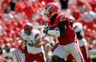
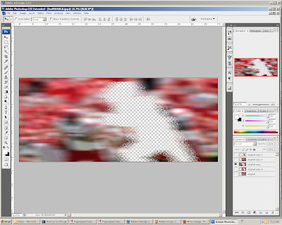
I found a photo on the AP Saturday night that I wanted to use in the skybox of Sunday's 1A (See above, and courtesy of The Associated Press), but I knew I would have to alter it a bit to fit it how I wanted it. Queue Photoshop. I managed to find an easy way to extend the left part of the photograph that #1 didn't look photoshopped (at least for what I used it for) and #2 didn't take me forever. And guess what? You get a step-by-step tutorial of how I did it! It's not going to be super specific, but if you need any other direction, just ask.
1. Extend the Canvas: I extended the canvas of my image by selecting Image > Canvas Size. You can save a step by anchoring the image to a corner or a side so you don't have to move things around afterward.
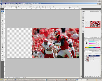
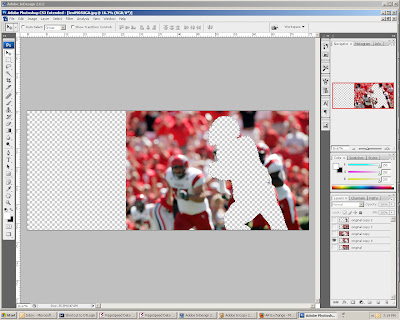
2. Layering it on: I made two more layers of the original image in the layers palette (Ctrl [apple] + J). Then I used the pen tool to trace around the football player on one of my copy layers. After I closed the path and saved it in the paths palette (double click and name, just like the layers), I clicked the "Load path as a selection" button on the bottom of the palette. It is the one that looks like a dotted-line circle. Then, I cut the player out of one of my copies, and by selecting the inverse (ctrl [apple] + I), I cut the background out of the second copy.
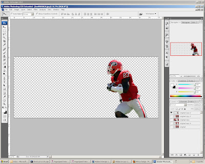
3. Blurring the image: From there, I made another copy of the original image and used a motion blur on it. You can do this by selecting Filter > Blur > Motion Blur. I set the distance at 268 pixels, but all you need to know is that the higher the number, the more blur you get. You can also set the blur to an angle, but I kept mine on 0 degrees for logic's sake. I used the same motion blur on the layer that is the exact copy of the original and the layer that had the football player cut out of it. To extend the image, I simply stretched the background cutout layer (ctrl [apple] + t) to fit the entire canvas.
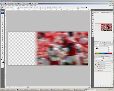
4. Finishing touches: I re-organized my layers so that I had the football player cutout on top, then the motion blurred copy, then the motion blurred cutout. From there, all I had to do was erase and blend a little bit of the edge of the motion blurred copy so that the two layers looked like they belonged on top of one another. As it ended up, I only really needed the top part of my image, but the experience was worth it. It only took me about 15 minutes to do. (It actually took me longer than that to type this blog.
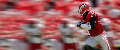
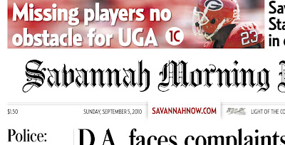
Here is how it was used in print:

I found a photo on the AP Saturday night that I wanted to use in the skybox of Sunday's 1A (See above, and courtesy of The Associated Press), but I knew I would have to alter it a bit to fit it how I wanted it. Queue Photoshop. I managed to find an easy way to extend the left part of the photograph that #1 didn't look photoshopped (at least for what I used it for) and #2 didn't take me forever. And guess what? You get a step-by-step tutorial of how I did it! It's not going to be super specific, but if you need any other direction, just ask.
1. Extend the Canvas: I extended the canvas of my image by selecting Image > Canvas Size. You can save a step by anchoring the image to a corner or a side so you don't have to move things around afterward.

2. Layering it on: I made two more layers of the original image in the layers palette (Ctrl [apple] + J). Then I used the pen tool to trace around the football player on one of my copy layers. After I closed the path and saved it in the paths palette (double click and name, just like the layers), I clicked the "Load path as a selection" button on the bottom of the palette. It is the one that looks like a dotted-line circle. Then, I cut the player out of one of my copies, and by selecting the inverse (ctrl [apple] + I), I cut the background out of the second copy.


3. Blurring the image: From there, I made another copy of the original image and used a motion blur on it. You can do this by selecting Filter > Blur > Motion Blur. I set the distance at 268 pixels, but all you need to know is that the higher the number, the more blur you get. You can also set the blur to an angle, but I kept mine on 0 degrees for logic's sake. I used the same motion blur on the layer that is the exact copy of the original and the layer that had the football player cut out of it. To extend the image, I simply stretched the background cutout layer (ctrl [apple] + t) to fit the entire canvas.


4. Finishing touches: I re-organized my layers so that I had the football player cutout on top, then the motion blurred copy, then the motion blurred cutout. From there, all I had to do was erase and blend a little bit of the edge of the motion blurred copy so that the two layers looked like they belonged on top of one another. As it ended up, I only really needed the top part of my image, but the experience was worth it. It only took me about 15 minutes to do. (It actually took me longer than that to type this blog.

Here is how it was used in print:

Subscribe to:
Posts (Atom)