
Wednesday, February 17, 2010
You can't miss: The importance of learning code
So, thanks to Elise, I started following Brian Hoff on Twitter and his blog. I don't know this guy, but according to his Web site and blog, he is a graphic designer from Philadelphia. OK, so what is so important about this guy? Well, he tweets and writes AWESOME things. Things about design, color, free sketch books and the like. My "You can't miss" from this week comes from him. It is a blogpost talking about the "5 Good Reasons Why Designers Should Code." Setting aside the grammar errors in the copy, the content is somewhat helpful. One of the reasons: "Your designs will be executed in exactly the way you want them too. If you completely split the duties of designing and coding there inevitably comes a point in a project where the coder ends up doing bits of design, at which point the design can start to degrade." I agree and would like to point out that using several different programs to design for the Web is helpful too. Use Photoshop, use Illustrator, use what you're comfortable with, then learn code. Its a pain, but it is oh, so useful.

Wednesday, February 10, 2010
You can't miss: Huge, ridiculous graphics
 I have been finding a lot of these lately. People send them to me or I randomly find things online. The Valentine one is from topcultured.com. I find these things endlessly entertaining because I love learning about things in a visual way. This one isn't as good at it, but in most of them, there's a theme or an image used to get certain statistics across.
 I absolutely LOVE this video game graphic from onlineeducation.net. Care is taken to display each statistic with style.For example, there's a statistic about the amount of female versus male gamers. The artist used bathroom symbols when he or she could have easily just stated the fact with a sentence. Farther down the graphic shows the percentage of console failure but doesn't state the consoles, just illustrations. I guess people who make it that far know what they look like? This could be an issue with some, but I think it adds to the novelty of the image.
Here's another one about coffee. It kind of tells a story, and when you get to the end ... you can buy it! This is designers making money!
Response: HelvetCIA
Do you have friends that play Dungeons and Dragons? I do. I make fun of them. But I still like them because everyone has some kind of nerdy tendency. I have a few. Typography is one of them. I ogle. I love how different typefaces can say different things. I was ogling the movie we watched in class, "Helvetica." The awesome part was that I was in a room with 16 other people also entranced by this documentary all about this typeface that is found literally EVERYWHERE. One of the more interesting parts of the film that I took away was the history behind the name and creation of the type. Linotype wanted to name it "Helvetcia," the Latin word for Switzerland. Instead, they went with "Helvetica" because the Swiss were being humble.
I liked this movie. A lot. And my friends have already made fun of me for it.
To honor this nerdy type moment, I am bringing back this video that circulated on the interwebs a few years ago. Enjoy!
I liked this movie. A lot. And my friends have already made fun of me for it.
To honor this nerdy type moment, I am bringing back this video that circulated on the interwebs a few years ago. Enjoy!
Critique: Digitally shaving a man's head
So this week I finished my first actually published feature for VOX. It was long, crazy, hectic and made me want to punch things. OK, I guess it wasn't that bad. Let's start from the beginning.
The story, to get us started, is a service journalism piece about the 7 (actually 8, but we lost one along the way) barbershops in Columbia. The assigning editor on the story had an idea of shaving the headline into the back of someone's head. Initially, I shot it down, but the more I thought about the VOX voice, the more I thought that maybe, just maybe, this idea could work. Photoshop is my stronger application when it comes to Adobe products, so I took on the task. I found this photo on Stock Exchange:

I also searched for some bald-headed guys to clone stamp onto the back of this music lover. I added noise to the "shaved" parts to make it look bumpier. It didn't look too hot. I also found it almost impossible to cut this guy's headphones off the top of his head, but that was fixable.

I took another stab at it, sampling skin from the guy's neck (that had stubble on it) to make it look more realistic. I also cloned some extra hair to add volume to the tufts showing between and around the letters. Finally, I had something, but it was not finished by a long shot ...


As for things I am currently working on...
The story, to get us started, is a service journalism piece about the 7 (actually 8, but we lost one along the way) barbershops in Columbia. The assigning editor on the story had an idea of shaving the headline into the back of someone's head. Initially, I shot it down, but the more I thought about the VOX voice, the more I thought that maybe, just maybe, this idea could work. Photoshop is my stronger application when it comes to Adobe products, so I took on the task. I found this photo on Stock Exchange:

I also searched for some bald-headed guys to clone stamp onto the back of this music lover. I added noise to the "shaved" parts to make it look bumpier. It didn't look too hot. I also found it almost impossible to cut this guy's headphones off the top of his head, but that was fixable.

I took another stab at it, sampling skin from the guy's neck (that had stubble on it) to make it look more realistic. I also cloned some extra hair to add volume to the tufts showing between and around the letters. Finally, I had something, but it was not finished by a long shot ...


- I had to find an appropriate typeface. This was hard. I was all over dafont.com, in multiple sections, looking for one. Thanks to Aimee, we finally picked out "Ballpark Weiner" (you can totally laugh) because it was kind of old school, like the head-text said.
- I arranged the barber shops so that they all go equal play and fit together like a puzzle (especially because the text was not the same length for every vignette), only to find out that they had to be arranged in alphabetical order instead.
- The sidebar story, on a gray box because I thought it balanced out all of the other color going on, had to be changed to be more colorful. (Not as big of a change as the rearrangement though.)
- Then there was an issue with the individual boxes, the gray lines I had separating things and the point size on the general information of each barber.
As for things I am currently working on...
- A "Getting things fixed" cover. It involves wrenches, words and some more sweet photoshop action.
- My historical research paper... though I can't figure out which magazine I want to research.
Wednesday, February 3, 2010
Response: The VOX voice
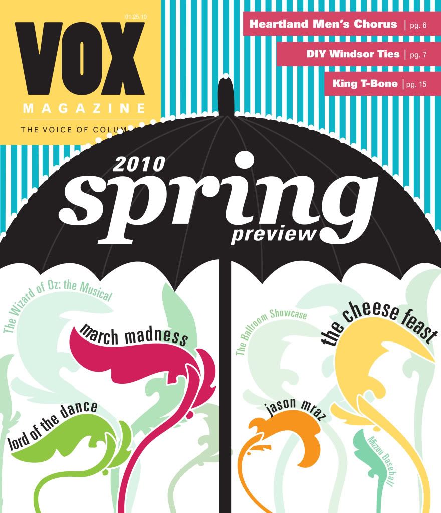 I would like to personally give a shout out to Cassie and her amazing Spring Preview design at left (And I hope it's OK that I took it for an example on my blog. In case anyone is confused, this design belongs to CASSIE MAY, not you!). It was creative and edgy — something I have learned is a must while designing for VOX. I have fallen in love with this cover design and its techniques, and it has helped me understand "the VOX voice" and what it actually means.
I have been working on my first actual feature design for VOX (that will for-sure be published at least) and I have really had to think about how VOX would tell the story, not just how a newspaper or some other magazine would tell it.
- VOX has attitude.
- VOX does not sit in the corner during a party — VOX is the life of the party.
- VOX is sarcastic and opinionated.
- VOX knows what it wants and doesn't take anyone's shit.
I have charged myself with channeling VOX's inner bad ass-itude more while coming up with ideas for my work. I'm not saying I will completely change my style, but I will definitely take into account what publication I am working for now.
As for what I am working on ...
The barber shop feature is coming along really well. While I still don't have all of the elements, I am making due with a draft of the text and an unedited batch of photos. I worked a lot in photoshop for this design, and I hope what I did looks somewhat realistic ... The design isn't finished yet, and I hope to get more feedback tomorrow in lab. Here's the photoshop work though. It still needs a little work, but I am pretty proud of it so far.

I am also working on some cover concepts for class on Thursday for a story about places to get things fixed. It reminds me of the "Best time to do stuff" issue VOX did a while back because it is kind of generic yet funny. I'll keep you posted on how that goes too.
Monday, February 1, 2010
You can't miss: Awesome typefaces of 2009
 I like designing type-driven spreads. I like coming up with cool new ways to look at type, but I don't know nearly as much about typeface current events as the recent contributors of ILoveTypography.com.
In reading the descriptions about the "Favourite Fonts of 2009," the adjectives that were used were very honest, authentic and descriptive. For example, "In reducing the contrast, this French Clarendon eschews Cowboys and Indians, and emancipates itself from the circus (the French Clarendon has been dubbed the «circus type»)." It is amazing how in-depth descriptions
 of typefaces can get. Every 'face has its own personality and time for it to be used.
I'm glad there are people in the world who enjoy type as much as I do.
Critique: Previewing Spring and designing departments
 Our assignment last week involved coming up with a concept and design for VOX's Spring Preview issue, an issue that highlights the cool things going on in Columbia this Spring. We didn't have any photos to work with — that and preview issues are normally done as illustrations on the front and mucho photos on the inside.
I went the springy, flowery route, which probably wasn't my best idea in the world, but I think the cover turned out really well. I used Photoshop and Illustrator to imitate a springtime image.
I wanted to use bright colors and highlight my favorite parts of spring, especially the sky and clouds. I took the brackets I used on the front to be inspired by the inside as well.

Looking at all of my classmates' designs for the inside compared to mine, I felt that I had the most newsy feel than the others. I'm not sure if that is good or bad though. Clearly, I also used the flower on the inside. My idea was to use a different spring flower for every month in the season.
 I understand what Aimee said about not representing them on the cover then. I would have definitely rethought that part. Looking at what the final layouts were for Spring Preview and how Lauren's design was very flexible, I understand why mine wasn't chosen. The feature ended up being 8 pages long and months were more than just one spread. Mine would have been hard to convert to that.
This week was also my first stab at department design. I design the music section for VOX, which is usually only one page, so it's not too difficult. Well, not only did I only have to design one page this weekend, but it also had a half-page ad on it. I tried to fit a story, photo, infoblurb and sidebar on the page... yeah, it didn't work out.
It wasn't hard work though. I have had enough experience designing on deadline at the Columbia Missourian that this was incredibly easy. The only detrimental difference was the VOX computers' lack of paragraph styles. I think Aimee said they were going to work on that though. I was also thrown off by the lack of style rules in regard to spacing. I get that some things can be eyeballed, but I have been trained to look at things differently. For example, text at the Missourian is supposed to go p6 beneath the descender of headlines. Some call it nit-picky, but some things should be uniform, right? I guess it all depends. I'll get used to it.
Subscribe to:
Posts (Atom)