Showing posts with label photoshop. Show all posts

Sunday, September 11, 2011

10 years ago today

Today I felt compelled to share my findings on Newseum.org. Everyday, the website compiles front pages of newspapers from around the world, and today seemed like a great opportunity to analyze the meanings and displays on papers across the nation. I picked out a few that I liked and that I thought were unique and different from the rest.

The Arizona Republic, Phoenix, Ariz.

The Arizona Republic in Phoenix, Ariz., put together one of my favorite fronts of the day. I have a few beefs with it, but overall, I think it is the most unique. Instead of creating an image of the towers with columns of text, like the San Diego Union-Tribune, below, the Republic  created a void, which goes perfectly with their quote-style headline, 'There's a hole in the world.' The only beef I have with the design is the flow of text from one "column" to another. After it creates the void for the first tower, I get confused as to which column I should be reading. For legibility, it should have been three columns of text with the two towers in the middle. I can see the allure of the asymmetry with the type, though.

The San Diego Union-Tribune, San Diego, Calif.

The two twin columns above seem like the easy thing to do, right? I mean, columns naturally look like the buildings. I have to give San Diego some credit, though, because I think the spacing and air to the page is just right.

Sioux City Journal, Sioux City, Iowa

The Sioux City Journal, above, did something different with typography that I don't think does the trick, either. It definitely needs an explainer paragraph on the front saying where the words came from, and, to me, it feels more artsy than actually conveying any journalism whatsoever. It does, however, get a lot of air.

Des Moines Register, Des Moines, Iowa

The Des Moines Register went on a cloning spree and Photoshopped a very literal translation of an image being burned into our eyes. I am inclined to like it if only because it breaks up the monotony of the file plan-crashing-into-the-towers photo. And it is definitely "eye"-catching.

Star-Ledger, Newark, N.J.

Speaking of breaking up the monotony, the Star-Ledger in Newark seemed to think the same thing. Instead of running file images of the attacks, they told the reader, "We do not need to tell you what happened 10 years ago today. You know." I love this unique take on the day, but I could have probably done with a shorter story on the front. It is neat, though, how the writer of the story was the same writer who reported on the attacks 10 years ago.

The Virginian-Pilot, Norfolk, Va.

Ahh, The Virginian-Pilot. Always with the innovations. Even though the front page is very self-explanatory, let me point out a few things. For one, this front is informative. It doesn't show you an image you have already seen, and it doesn't tell you something you already know (well, some you may). It gives you facts, albeit snarky ones (i.e. Number of Osama bin Ladens: 1 —> 0).

West Hawaii Today, Kailua Kona, Hawaii

West Hawaii Today is the only paper I picked that used the file photos of the towers because they went big. They flipped the front page and used the iconic image to speak for itself.Yes, it's an image we have already seen before, but they repurposed it for the anniversary.

These are just my opinions, folks. I haven't spoken to the designers of these papers, and all I know is what I see. However, I do suggest people check out the front pages for themselves on Newseum.org. A direct link to today's papers will probably be posted on the site tomorrow, and I will in turn post it here.

Saturday, September 4, 2010

My own personal content aware feature

When CS5 was released, one of the major selling points of Photoshop was the "content aware" feature. It made erasing blemishes or unwanted elements from a photo a two-click process. No more clone stamping the hell out of things, no more masking, erasing, painting and replicating. Sounds nice right? Well, it does all come for a price, and I already have CS4. So, I make due.


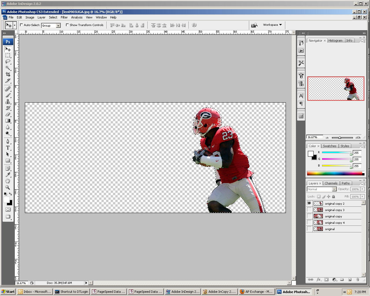
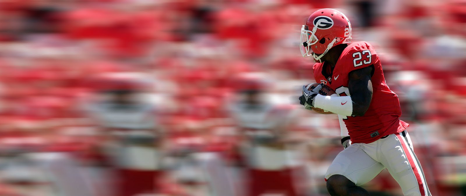
I found a photo on the AP Saturday night that I wanted to use in the skybox of Sunday's 1A (See above, and courtesy of The Associated Press), but I knew I would have to alter it a bit to fit it how I wanted it. Queue Photoshop. I managed to find an easy way to extend the left part of the photograph that #1 didn't look photoshopped (at least for what I used it for) and #2 didn't take me forever. And guess what? You get a step-by-step tutorial of how I did it! It's not going to be super specific, but if you need any other direction, just ask.


1. Extend the Canvas: I extended the canvas of my image by selecting Image > Canvas Size. You can save a step by anchoring the image to a corner or a side so you don't have to move things around afterward.


2. Layering it on: I made two more layers of the original image in the layers palette (Ctrl [apple] + J). Then I used the pen tool to trace around the football player on one of my copy layers. After I closed the path and saved it in the paths palette (double click and name, just like the layers), I clicked the "Load path as a selection" button on the bottom of the palette. It is the one that looks like a dotted-line circle. Then, I cut the player out of one of my copies, and by selecting the inverse (ctrl [apple] + I), I cut the background out of the second copy.


3. Blurring the image: From there, I made another copy of the original image and used a motion blur on it. You can do this by selecting Filter > Blur > Motion Blur. I set the distance at 268 pixels, but all you need to know is that the higher the number, the more blur you get. You can also set the blur to an angle, but I kept mine on 0 degrees for logic's sake. I used the same motion blur on the layer that is the exact copy of the original and the layer that had the football player cut out of it. To extend the image, I simply stretched the background cutout layer (ctrl [apple] + t) to fit the entire canvas.


4. Finishing touches: I re-organized my layers so that I had the football player cutout on top, then the motion blurred copy, then the motion blurred cutout. From there, all I had to do was erase and blend a little bit of the edge of the motion blurred copy so that the two layers looked like they belonged on top of one another. As it ended up, I only really needed the top part of my image, but the experience was worth it. It only took me about 15 minutes to do. (It actually took me longer than that to type this blog.


Here is how it was used in print:

Saturday, August 7, 2010

Photoshop tutorial: The scream

I was inspried by a coworker to practice my Photoshop skills during downtime at work. I consider it honing my skills while waiting for pages to proof. So last night, I looked up Photoshop tutorials and took a crack at one involving smoke and a human protrait.


Instead of going with a woman's face for the image, I decided to replicate something I had seen on Fringe, one of TV's coolest sci-fi shows on right now. The show has certain recurring symbols, and the scream above is one of them. Changing up the steps a bit in the tutorial, I found a man's angry profile on Google images to work from.


From there, I cut out the guy's background and stylized the image so that I was just using the edges of this face as a guide. You can find the full instructions here. I used Photoshop smoke brushes provided by the same webiste, and I manipulated them into the outline of the man's face. After adding a couple filters (clouds, blurs), I overlaid an angry-looking gradiant that reminds me of the colors of fire. The colors are colder when the fire is the hottest. Here is my final project. What do you think? Kind of scary right?


It also kind of reminds me of when Voldemort leaves Professor Quirrel's body in the Harry Potter and the Sorcerer's Stone movie... Yep, I went there.